Transforming Raw Bioprocess Data into Actionable Insights
Industry
Life Sciences / Biotech R&D
Scope
Data Visualization / Grafana / UX/UI Design / Alarm Management / P&ID Digitalization
Timeframe
3 months
-
100%
Alignment – digital dashboards now perfectly mirror the updated physical P&IDs.
-
12+
Bio-KPIs integrated into live visual trends (previously Excel-only).
-
0
IT Tickets required for scientists to create temporary custom charts for analysis.
01
CLIENT
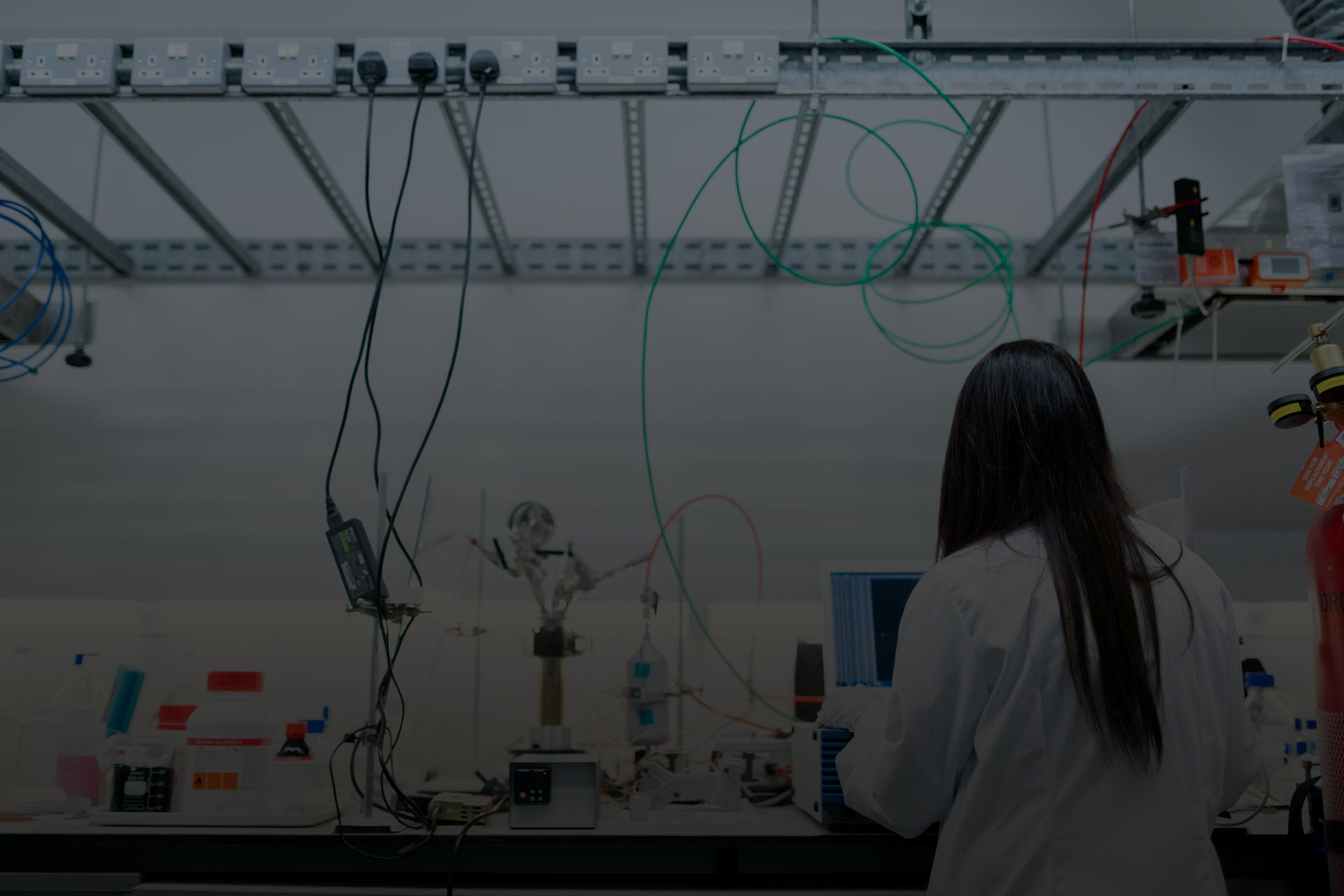
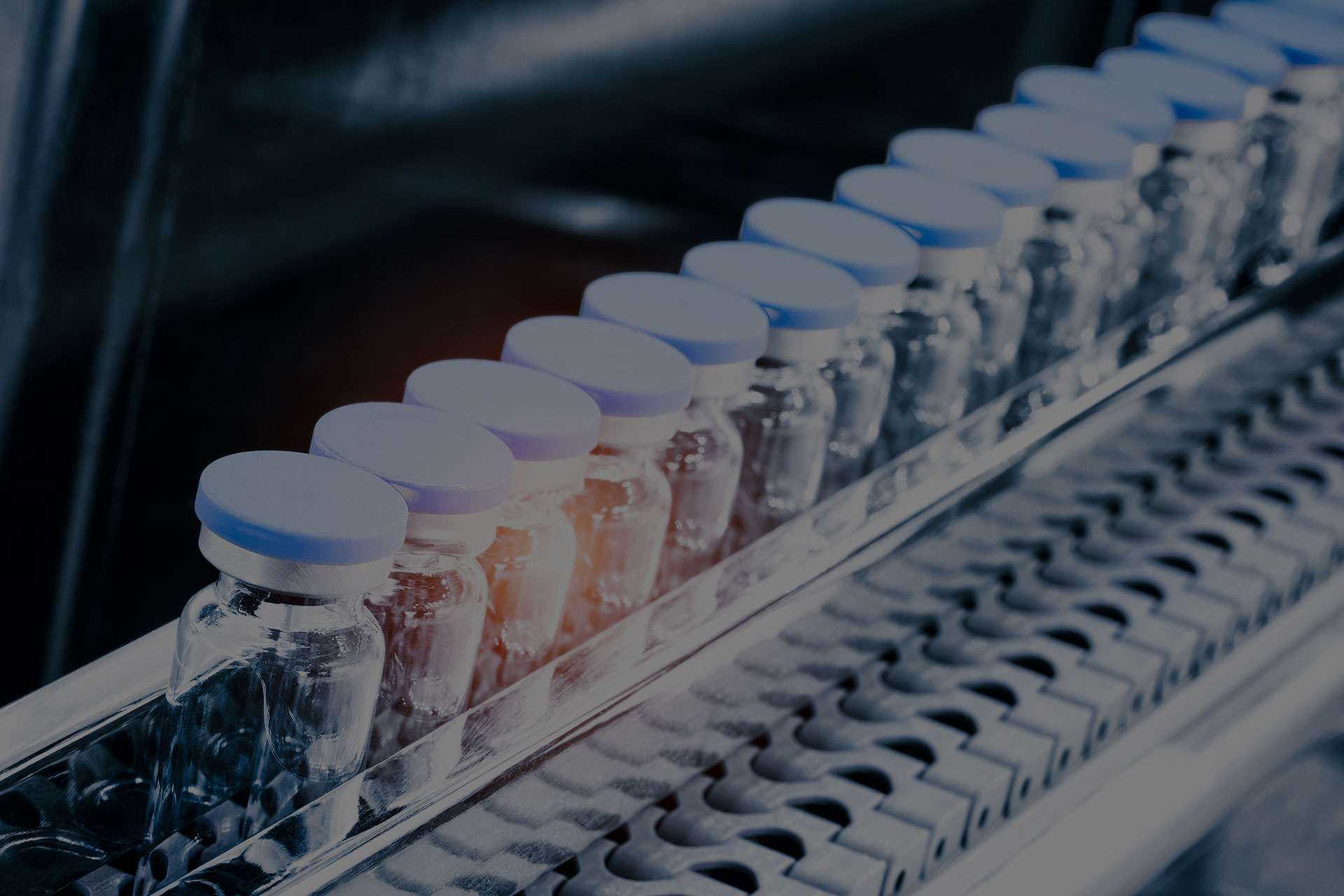
A global leader in biopharmaceutical development, operating complex R&D facilities looking to optimize real-time visibility into bioreactor conditions critical for cell viability and product yield.
02
BUSINESS NEEDS
While the client had massive amounts of data flowing from their bioreactors, the visualization tools (legacy SCADA screens) were rigid, cluttered, and difficult to interpret. They required a flexible, intuitive interface that mirrors the physical reality of the lab to democratize data and speed up decision-making.
03
CHALLENGE
To help our client achieve its goals, we overcome the following challenges:
-

Cognitive Load
Operators were overwhelmed by dense tables of numbers and poorly organized charts, leading to "alert fatigue." -

Visual Disconnect
The digital dashboards did not match the updated physical Process & Instrumentation Diagrams (P&ID), causing confusion during troubleshooting. -

Lack of Autonomy
Scientists could not customize views for specific experiments; every minor change required an IT ticket. -

Data Silos
Critical biological KPIs (like VCD - Viable Cell Density) were tracked in Excel, separate from the live process trends.
04
SOLUTION
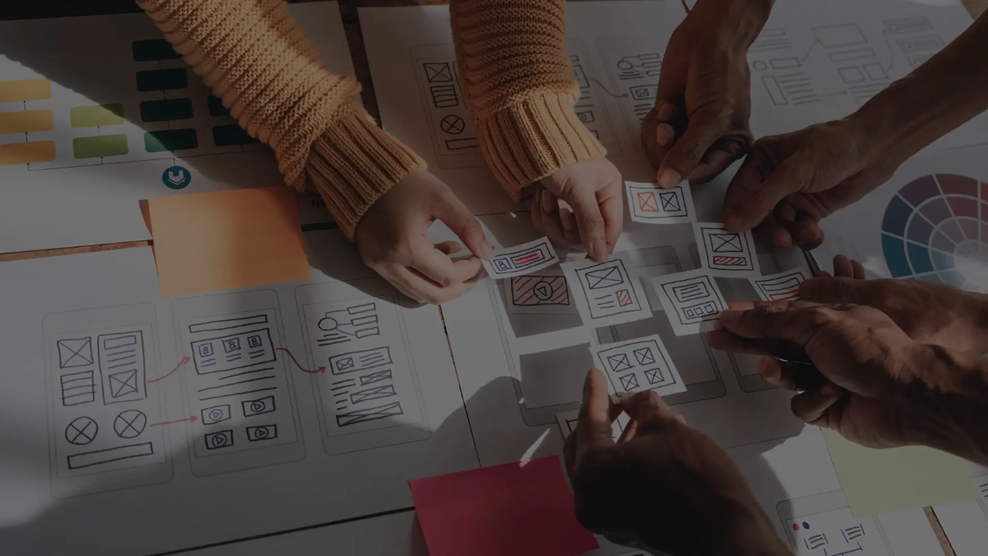
We executed a comprehensive "UX-First" redesign of the laboratory visualization stack using Grafana, transforming it from a passive monitoring screen into an interactive scientific workspace. The solution entailed:
- Visualization P&ID-Based We rebuilt the main dashboards to visually replicate the physical piping and instrumentation (P&ID) of the bioreactors.
- Self-Service Customization Implemented a flexible architecture that allows scientists to build their own "scratchpad" charts on the fly.
- Smart Alarm Management Redefined the alerting logic to categorize notifications by severity and highlight only critical deviations.
- Integrated KPI Layer Visualized calculated biological metrics (Growth Rate, VVD, Bleed Rate) directly alongside physical sensor data.


High-stakes bioprocessing requires absolute clarity for operational safety. Aligning digital dashboards with physical P&IDs and implementing user-defined views transitions the focus from system navigation to process integrity. This technical alignment minimizes operator cognitive load and ensures precision in high-stress environments.
Jacek Fischbach
Delivery Executive
Technology used
05
OUTCOME
- Enhanced Awareness Immediate visual correlation between physical components and digital data thanks to P&ID mapping.
- User Empowerment Scientists now independently configure ad-hoc visualizations, reducing IT support requests.
- Faster Reaction Time Streamlined alarm visualization reduced the time to identify critical process deviations.
- Full KPI Integration 12+ Bio-KPIs integrated into live visual trends, previously tracked in Excel only.
06
IMPLEMENTED SOLUTION
-

P&ID Mirroring
100% alignment – Digital dashboards now perfectly mirror the updated physical P&IDs. -

Autonomous Analytics
0 IT Tickets required for scientists to create temporary custom charts for analysis. -

Real-time KPI Tracking
Direct visualization of Growth Rate, VVD, and Bleed Rate alongside live sensor data. -

Context-Aware Alarms
Alerts categorized by severity to eliminate noise and focus on critical batch threats.
-
100%
Alignment – digital dashboards now perfectly mirror the updated physical P&IDs.
-
12+
Bio-KPIs integrated into live visual trends (previously Excel-only).
-
0
IT Tickets required for scientists to create temporary custom charts for analysis.